←back to roadmap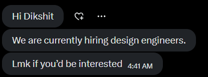
Why Portfolio Matters
My portfolio at dikshit.tech has helped me land numerous opportunities.
People notice portfolios so much that I just added a section to mine and received this message from a founder:
And here's how the founder of ReferRush (backed by Nikhil Kamath) reacted to my portfolio:
The "Secret"
Being very honest, there's no secret sauce. It's just about updating it regularly and having a deep understanding of UX while constantly analyzing analytics. The key is ensuring recruiters get a good gist of you within the first 10 seconds of landing on your portfolio.
12 Steps to Build a Converting Portfolio
Many people might disagree, but a portfolio where content is written within 60% of the width has much better readability and creates better user experience. Give your words room to breathe and let white space work for you.
Try different widths:
Current width: max-w-2xl (optimal)
I've kept a theme of muted, bland colours complemented by bright accent colours that create visual interest and hierarchy. This creates a natural hook for the eyes and guides attention where you want it. You can create something unique for your portfolio that reflects your personality.
Compare color schemes:
Current palette:
Sample Portfolio Header
This is how your content would look with this color scheme. Notice the readability difference.
Call to Action
✅ Easy to read, professional, guides attention naturally
Everything on your portfolio should be exactly what you want to convey to a recruiter with clear messaging and purpose. Make sure they get a complete gist of who you are, what you do, and why they should hire you in the first glance without overwhelming them with unnecessary information.
No fluff or unnecessary words that dilute your message and waste precious reading time. Every single word that's there should hold value and contribute to your story. If a sentence doesn't add anything meaningful, cut it ruthlessly.
Structure your content with clear visual hierarchy that guides the reader's eye naturally through your story. Adding relevant images and proper spacing helps keep the recruiter hooked and engaged with your portfolio throughout their visit.
Personal opinion: I'd suggest having a real picture of yourself that shows your personality and professionalism combined. I believe it builds more trust and makes you more relatable to potential employers. I could be wrong, but it's worked exceptionally well for me.
Animations should elevate the experience and add meaning, not exist for the sake of looking fancy or trendy. My POW and 'Hire Me' section animations are examples of conveying meaning without requiring text to be read. Avoid fade-in-on-view animations — recruiters have 10-15 seconds to scan your portfolio. Don't waste 3-4 precious seconds on unnecessary loading effects.
Make sure you've mentioned somewhere what makes you different and better than others in your field with specific examples. Maybe a 'Hire Me' section or something similar that highlights your unique value proposition and competitive advantages clearly.
Check out portfolios that convert and actually land people jobs in your target companies. Pay attention to what section comes first, how information flows, and what gets prioritized in the visual hierarchy. Learn from what works and adapt those principles.
Remember: a good portfolio is the only way to hold a recruiter's attention for longer periods and make lasting impressions. Every decision you make should serve this purpose and contribute to getting you that interview or job offer.
Recruiters won't wait 5+ seconds for your portfolio to load - they'll move to the next candidate immediately. Focus on image compression, lazy loading, and Core Web Vitals to ensure fast loading times. Mobile performance is especially critical since many recruiters browse on phones during commutes or breaks.
Feel free to check out my portfolio to see how these principles are applied in practice.
built by dikshit with ❤️